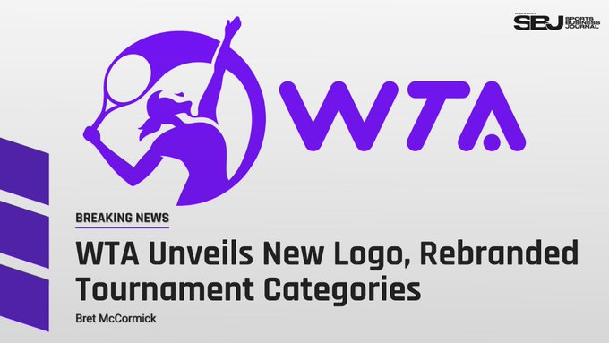
The WTA underwent a comprehensive rebrand which includes a new logo, new marketing campaign and alignment of tournament tiers.
The change came as a bit of surprise but it was done as an attempt to redefine the organization's strength as a collective unit of inspiring athletes and tournaments.
The launch also reveals a new 'WTA For The Game' campaign that highlights the driving forces of the sport, aimed at creating deeper fan connections. The rebranding, which includes the WTA’s first logo redesign in 10 years, coincides with the announcement of a simplified numerical naming system for WTA tournaments.
The WTA’s new brand image incorporates a dynamic reworking of the familiar letters W, T and A – with a tennis ball functioning as the crossbar of the A – and marks a return to a silhouette of a female tennis player. Micky Lawler, President of the WTA said of the change:
“The WTA is built on the grit, passion and determination of generations of athletes and tournament promoters. Our new logo embraces the visual language of tennis and celebrates heroic women who come together ‘For The Game.’ We will wear it as a badge of pride and a reminder of the power of unity among strong individuals – by joining forces, we build something bigger than ourselves.”
claps 0visitors 0
Just In


Popular News


Latest Comments
- This testing should have been done years ago as a prerequisite to competing in any male or female sport. Safety First -- Biology Rules!!
 mandoist21-07-2026
 - Poor Aaron has been so bothered, for so long, by this possibility of proving one is NOT a male in a female sport that his list of unproven, unsupported claims is laughable. Claiming "privacy" and "Rights" is nothing short of lame. I challenge Mr. Solomon to take advantage of his "Right" to take a punch from that Algerian "female" boxer (whom failed testing -- and subsequently continues to play the system). This is the one who has injured several female opponents. WTA should absolutely not receive any credit for this common sense ruling!!! They have finally been forced to do so by the IOC. Imagine, after far too many years and injuries by males hurting females, "gender equality" comes to the sport of tennis (females competing with genuine biological females).mandoist21-07-2026
- Hurry on back Carlos! We miss you!!Rapunzel17-07-2026
- Well done to the author of this article!! A meltdown is what Coco experienced at the US Open the year she was chirping at her box, very near to tears, double faults were in great supply and she simply could not get a handle on that match. THAT AP is a meltdown!!Rapunzel12-07-2026
- This sensible approach helped Muchova... and look where she will find herself tomorrow (Wimbledon Final). Iga's wise to escape... especially to Nature and so. The wilderness (forests, lakes, mountains) has been my "Church" and escape from The Noise since I was a kid. She'll do well in the end.mandoist10-07-2026
- "Like if it was hotter, I probably would have won, I'm not gonna lie." Geezus...mandoist08-07-2026
- This one has totally lost the plot. She is about to cross the racism line in her hatred for Russian people. NEWSFLASH DARLING -- Russian majority of citizens (and your ex-Colleagues whom you shamed) are not who you should be aiming at. Grow up.mandoist08-07-2026
- Why do all these "experts" feel the need to publicly "tell players" what they need to do, or what they're doing wrong?? How about this -- if you're so concerned with a player's situation actually take the time to contact the team in question and talk directly to them. Yapping in public media is rarely, if ever, helpful.mandoist07-07-2026
- Gee... preferential treatment all the way to the end? STOP IT WTA & WIMPLEDON !!! This entire WILLIAMS CHARADE is 100% unfair to young upcoming players who legitimately earned a shot at a Wildcard. The whole scenario with these freebies to The Williams' is pathetic and barely within the rules (which have been bent like a pretzel to accomodate them). The lamest excuse this time is "...she is a top draw". How does that apply to Wimbledon which is sold-out in advance? Stop enabling this abhorrent "Look at me" behavior. If they want to make believe they can compete -- LET THEM PLAY QUAILIFIERS LIKE EVERYONE ELSE.mandoist06-07-2026
- Is it not clear there is a mental issue here? I mean, her judgement is very suspect given her personal life 'experiences'.mandoist06-07-2026

Loading